Starting Small
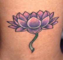
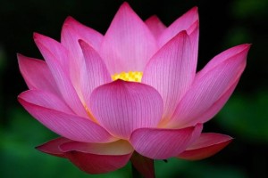
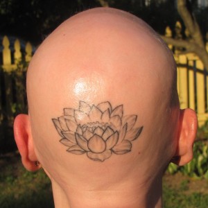 I decided to begin with just one simple tattoo on the back of my head. This way I could see how I did with the tattoo process (i.e. did it hurt a LOT or a little bit) and then decide how much more to do. I wanted to begin with a lotus flower since the core part of my Buddhist practice is reciting the title of the Lotus Sutra (Nam-myoho-renge-kyo). The lotus also happens to be a very popular tattoo design which meant there were many photos online that I could use to zero in on the style I wanted. Ultimately I found a tattoo example and a photo that, taken together, best captured what I was looking for. I sent these to Amy and she created the tattoo outline. I decided to hold off on doing any color shading so that I could see how the whole design came together before committing to adding color.
Documenting Feedback
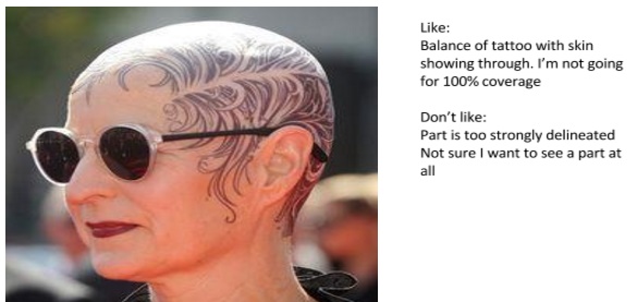
In developing the design I pulled together photos that I generally liked but I also added comments on what I didn’t like about them. This was helpful to set the direction of the design at the very beginning when Amy and I first started working together. Here is an example:
In Progress Photos
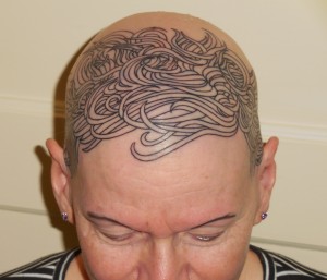
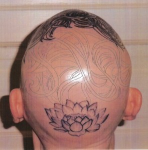
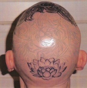
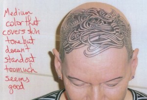 One benefit of spreading out the work over multiple sessions two to three weeks apart is that it gave me time to refine the ideas for what we would do in the next session. After the outline was done on the front I tried different methods to visualize options for how we could do the shading. Ultimately the low-tech method of drawing on the photos turned out to be an easier way to capture the look I was going for in the next stage.
The Transition Area
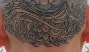
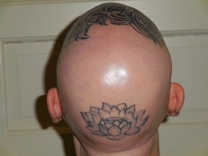 By far the biggest challenge for the entire project was developing the design to use between the hair-like look in the front and the lotus in the back. I moved forward with the outline and shading on the front with the confidence that I would figure something out that would work as a transition. This was a large area to fill. You can see the faint outline of a stencil we had tried as a test.
Google Time
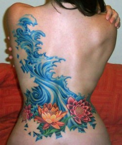
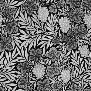 I was looking in many different directions for inspiration. I put in lots of “Google time” finding photos of tattoos, drawings and even William Morris wallpaper. I liked the idea of vines and leaves as a way to move from the hair into a more graphic design. And I wanted something like water below the lotus (since that’s where you would find a lotus flower). I downloaded so many files that I started to feel overwhelmed and a bit discouraged about pulling it all together. The low point was the ten minutes or so when I was seriously considering doing a headband (!) because I couldn’t find a way to manage the transition from front to back.
The Breakthrough
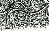
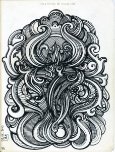
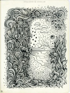
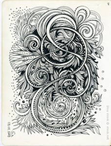
Then I came across the artwork of a Russian artist named Irina Vinnik. This was what I had been looking for. Her drawings had the elements I wanted — the feel of hair, a sense of movement, an organic component and a graphic design that could be translated into the tattoo medium.
Editing Techniques
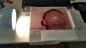 The last stage of my design work was to figure out what parts of these wonderful drawings would work best in the space available on my head. I tried using a photo editor to superimpose the images onto the photo of my head. But that became a big technical challenge that wasn’t moving the artistic vision forward. I decided to create a light box using just a piece of glass and my desk lamp. This worked out great. I was able to trace portions of different drawings onto the photo to see what was the best all-around fit. It was still just an approximation because the flat surface of the photo doesn’t take up as much space as the curved head. Still, the tracings helped me to see that the drawing I originally liked the most was not as well-suited to creating a transition between the hair and the lotus. I printed several other drawings from the same artist and played with viewing different parts of each drawing under my photo in the light box. I was most happy with using a portion of the one with the circular section.
The Final Touch
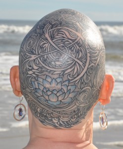
I was able to use a section of the middle Vinnik photo above under the lotus. This gave the “water” feel I was going for while also keeping the same feel as the rest of the design.
